×

LEARN MORE ABOUT THE WORKSHOP KIT
Enter your email below and we will keep you updated as more information is released about the kit.
Steve Jobs famously said no to PowerPoint.
“It's not you, it's us”, he said.
“PowerPoint presentations somehow give permission to gloss over ideas, flatten out any sense of relative importance, and ignore the interconnectedness of ideas,” he is quoted as saying in Working Backwards by Colin Bryar and Bill Carr.
While I agree that PowerPoint is notoriously difficult to get right, you know that I agree wholeheartedly about the sense of relative importance and interconnectedness of ideas.
I've built a career out of helping people with these two things.
I am also a realist and note one other significant challenge in the PowerPoints I see every week: making the visuals simple and clean, particularly when communicating complex ideas.
So, I am offering a 25-page library of ‘cut and paste' images that might help you.
My colleague Neil Young has put them together and invites us to share them.
I personally find them useful and hope you will also. Download here.

I love what I do.
I help senior leaders and their teams prepare high-quality papers and presentations in a fraction of the time.
This involves 'nailing' the message that will quickly engage decision makers in the required outcome.
I leverage 25+ years' experience including
My approach helps anyone who needs to engage senior leaders and Boards.
Recent clients include 7Eleven, KPMG, Mercer, Meta, Woolworths.
Learn more at www.clarityfirstprogram.com
(*) Numbers are based on 2023 client benchmarking results.

Many have called for the Death of PowerPoint as they are understandably under-whelmed by so many presentations.
But given the many complex elements that make up a powerful presentation, it is too simplistic to blame the presentation tool.
It is, after all, hugely powerful when managed well and so widely used it is hard to kill off.
So, the question remains: how do we create consistently powerful presentations with or without PowerPoint?
Two words: stop rambling.
If the presenter gets to their point quickly they will engage their audience far better than dragging everyone through all the background detail and a seemingly endless list of irrelevant charts and diagrams first.
Here are four ideas to help you stop rambling your presentations (using whichever tool you prefer):
Firstly, the hard part: Identify the main point you need to make for this particular audience – your ‘so what' – and write it in a sentence.
Yes, just one. Write it in 25 words or less, in words that are simple and clear enough for someone removed from the situation, such as your grandmother, to understand.
Secondly, chunk your supporting points in a way that will work for your audience
Work out if you need to persuade your audience that this is the right big idea, or whether they will want to know how to implement it.
Thirdly, create your PowerPoint (or Keynote, or Slides presentation) and get someone to help you with the visuals if they are critical to your presentation.
Neil Young of www.ogcommunicationdesign.com is both fast and fabulous. With or without Neil, make sure you have one message on each page and a diagram to match, avoiding too many bullet points and using font that is large enough for your audience to read. Wherever possible, use more pages rather than less.
As you have already worked out, there is quite an art to this.
Gene Zelazny of McKinsey & Company fame provides outstanding counsel on this subject in his two excellent books: Say it with Presentations and Say it with Charts. Both are available from his website: www.zelazny.com.
I take no fees from either Neil or Gene.
Lastly, make like Winston Churchill.
Wear a hole in the carpet as you walk back and forward in front of the mirror practicing until you get it right.
There really are no shortcuts, either with making a good presentation or with getting rid of PowerPoint.
______________________________________________________________________________________________________________
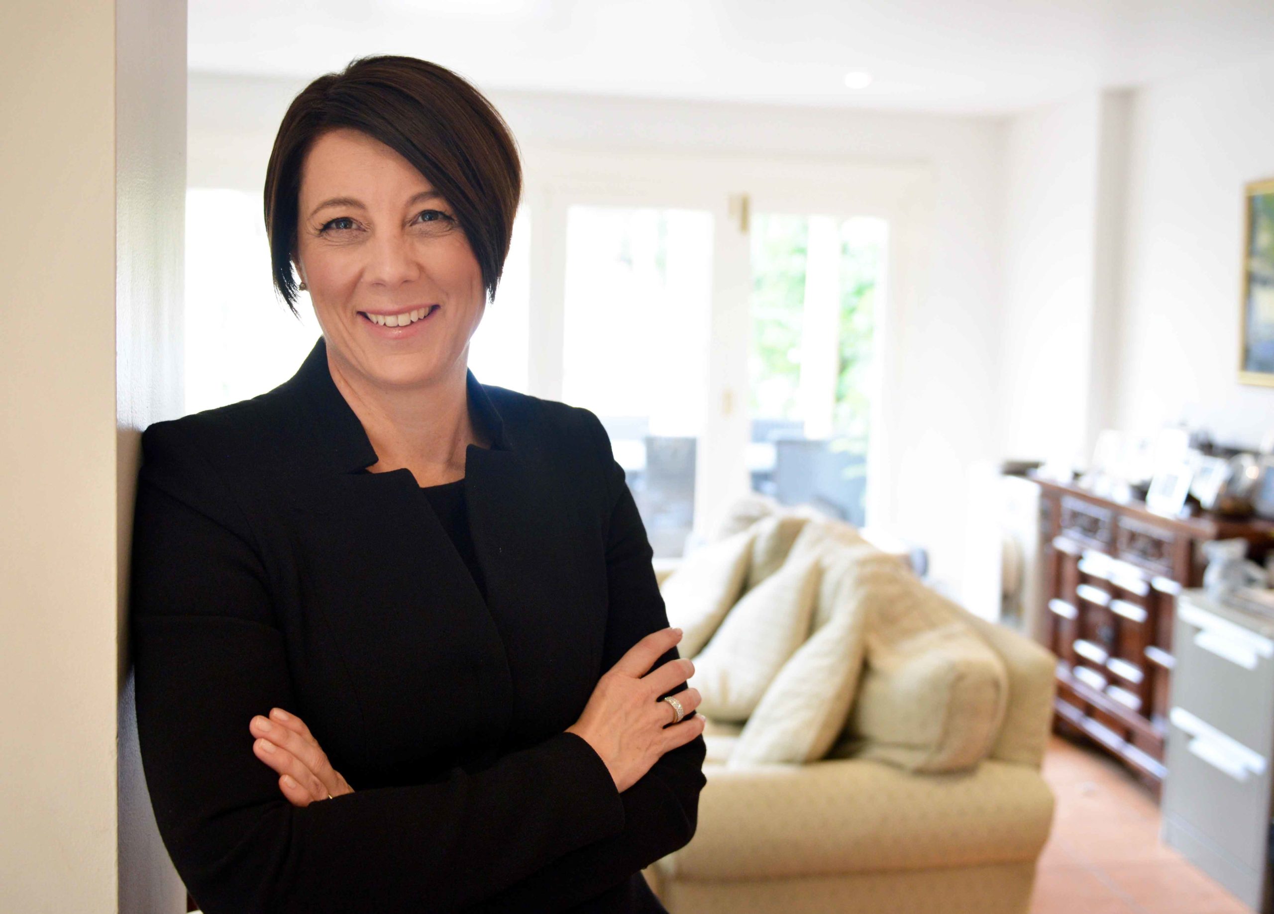
 Davina Stanley is founder of the Clarity First Program, which helps mid-career experts communicate so their good ideas get the traction they deserve – fast.
Davina is a fan of PowerPoint (when used well) and of Neil Young who is a master information designer.
Neil can be contacted at [email protected]